OpenGrid
Version 1.3.0

Department of Innovation & Technology
Table of Contents
- Getting Started
- Acknowledgements
- User Documentation
- Base Map
- Types of Searches
- Existing Queries
- Data Formation
- Saving Searches
- Administrator
Getting Started
Overview
Open Grid is a geographical information systems developed for residents to access public city data in a more intuitive manner. The application supports situational awareness, incident responses and monitoring, historical data retrieval, and real-time advanced analytics.
OpenGrid design has a three-layer service architecture: Presentation, Business and Data. The presentation layer provides the application’s user interface which is a static HTML/JavaScript based GUI that presents a more intuitive and modernized approach that support usage and accessibility on any mobile device and terminals in public safety vehicles.
Business layer which is the service layer implements the business aspects and functionality of the application. Such as defining business rules, design, deployment, maintenance and management of the application which is adaptable based off client specification.
The data layer is where information is stored from databases. OpenGrid utilizes MongoDB, a NoSQL open source document database optimized to handle spatial data. Mongo provides high performance, high availability and automatic scaling. The application interacts with different database engines or APIs which makes it easy for other cities: governments, non-profits and/or corporations to adopt the application.
OpenGrid offers configurable methods where administrators can define user roles, system authenticators or remove security features, where verification is no longer a requirement for application accessibility. Administrators can apply certain functions and data-set/s to a specific security group/s and/or users, if relevant.
Acknowledgements
OpenGrid was developed with the support of Bloomberg Philanthropies.
User Documentation
User documentation is designed to assist end users with the use of OpenGrid product and services. Upon usage of documentation the user will gain appropriate knowledge and capabilities to navigate the system. The user will inherit an understanding of the system, its processes and have the foundation to execute queries for navigation.
Supported Browsers
OpenGrid supports both mobile and desktop versions search engines. Mobile Android devices support Firefox version 40+ and Chrome 44+. Ios devices support Chrome 45+, Safari 8.1+ and Firefox 40+. Desktop versions support Firefox 42+ and Chrome 46+; Internet Explorer is supported from IE10+ no older versions will be continued. All browsers must have cookies enabled and support JavaScript/ECMAScript version 5.1.
Login/Logout
When the application is initially opened through a browser the login screen will appear (If authentication feature is activated). Prompting a cursor within the username textbox; the login button is initially disabled until both username and password has been entered. Once the user information has been provided and the login button has been selected, the user credentials will become validated against the system.

Figure 1. OpenGrid Login Screen
If login failed, an error message will appear: “Login failed due to invalid username or password.” The system will allow the user to re-enter a valid username and/or password.

Figure 2. Login Error Message
If login was successful, the landing page will launch.
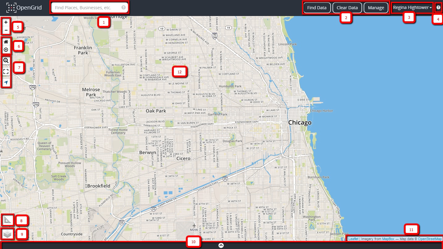
Figure 3. Landing Page
The Landing Page
The Landing page image shown above in Figure 3.
| Element No. | Element Name/Description |
|---|---|
|
|
Quick Search box is used to perform basic searches on datasets. The question mark icon within the Quick Search box displays a cheat sheet for quick search syntax. |
|
|
|
|
|
User Credentials – Displays the name of the currently logged in user also provides the logout functionality, which is located within the drop-down menu to the right of the username. |
|
|
User Manual Icon – Link to accessing the user manual. |
|
|
Zoom In and Zoom Out Icon 
|
|
|
Reset Map View and Area Zoom Icon 
|
|
|
Zoom specification Icon  Full-Screen Icon  Geo-location Icon 
|
|
|
Measurement Tool |
|
|
Layers Icon
Grid Views:
Open Weather Layers:
|
|
|
Expandable Table view panel |
|
|
Map attribution; displays a link for any copyright information, terms of usage, etc. |
|
|
Main map display. |

Session Timeout
Once the landing page has been displayed if there's been no server activity on the application after four hours the user will be logged out automatically with a message appearing. See Figure 4 below:

Figure 4. Message when Session Times Out
Base Map
Map Layers
The layers icon displays multiple basemap views and open weather layers. The list is built dynamically based on what's available through the Map Service provider. In the lower right hand corner on the grid, there is information and active links provided about the map services. The initial launch page displays the default basemap, Street View. For all other basemaps see Figure 5a and 5b below.
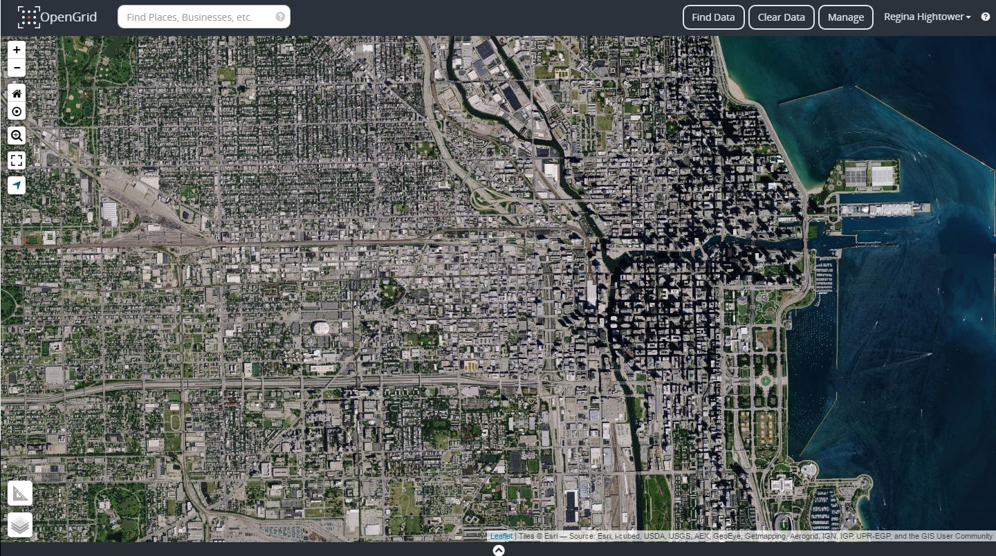
Figure 5a. Aerial View
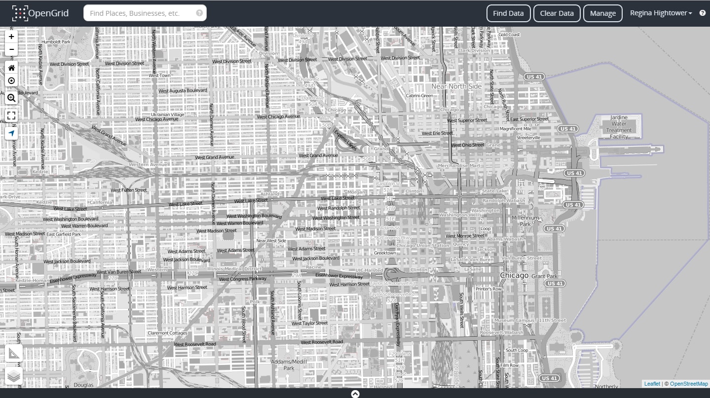
Figure 5b. Black and White View
Map Legend
A dynamic legend displays a representation of the search that's been executed. If, multiple parameters types with the same dataset is created and executed; the search will display on the grid the dataset and its parameters types based off the color represented in the setup. The Legend will have the dataset shown twice with its own color.
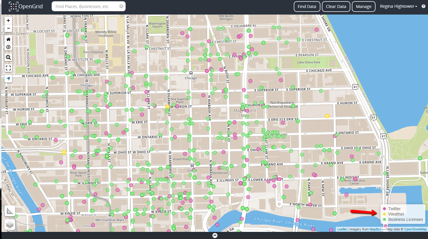
Figure 6. Map Legend
Map Navigation
Navigation tools are used to aid users in finding their way around a map. Using navigational controls, the user should be able to:
- zoom in/out
- reset the map
- pan to any direction
- switch to full screen mode
- activate geo-location
- apply layers
- apply measurements
- select hyperlinks
Measurement Tool
By selecting the measurement icon, the measurement tool can be turned on to enable measurements of the following:
Linear Measurement
- Distance between points
Area Measurement
- Distance around a point
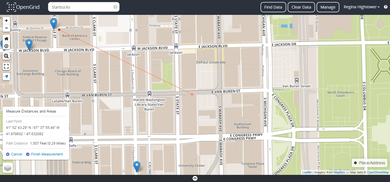
Figure 7a. Linear Measurement
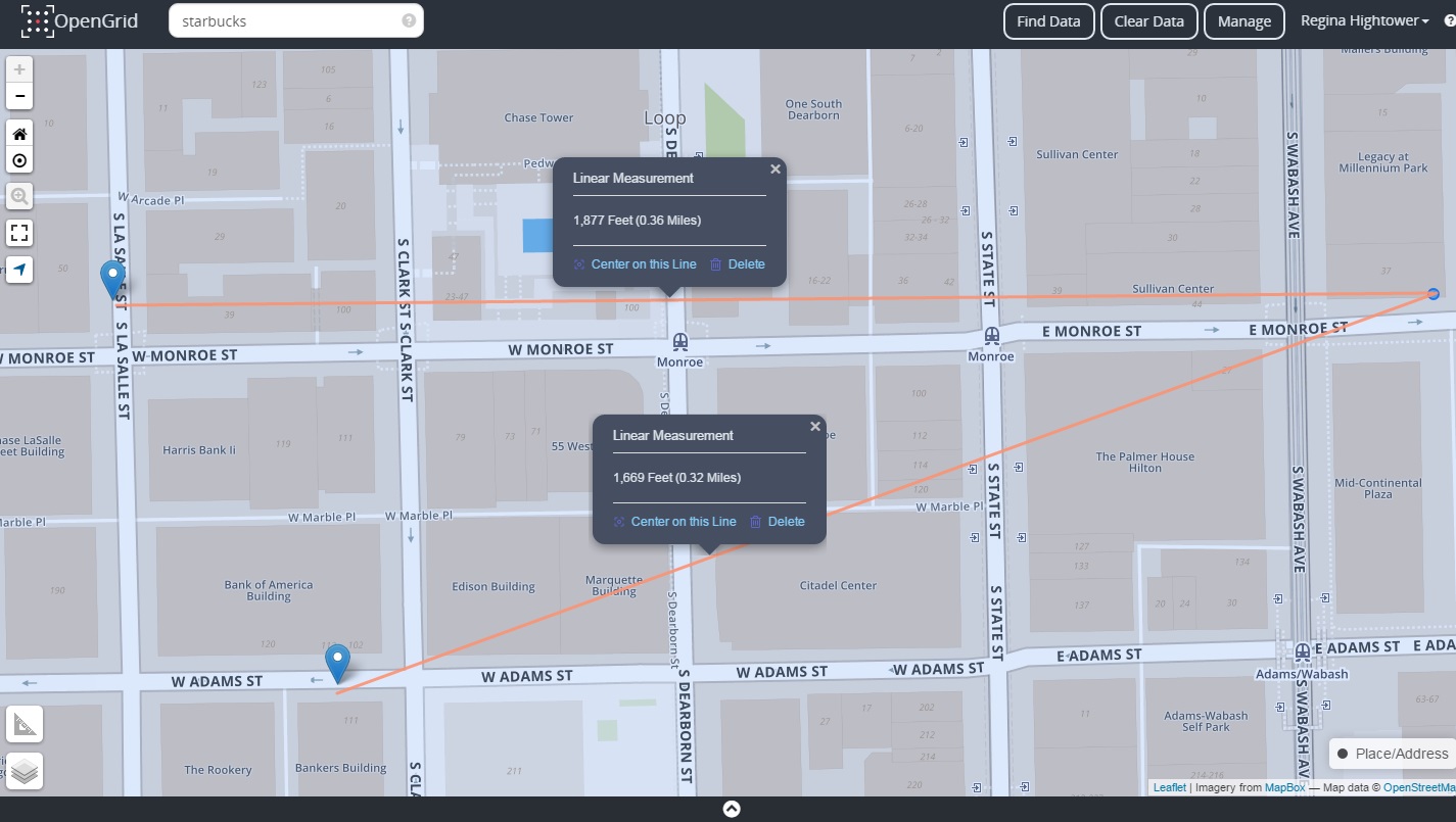
Figure 7b. Multiple Linear Measurement
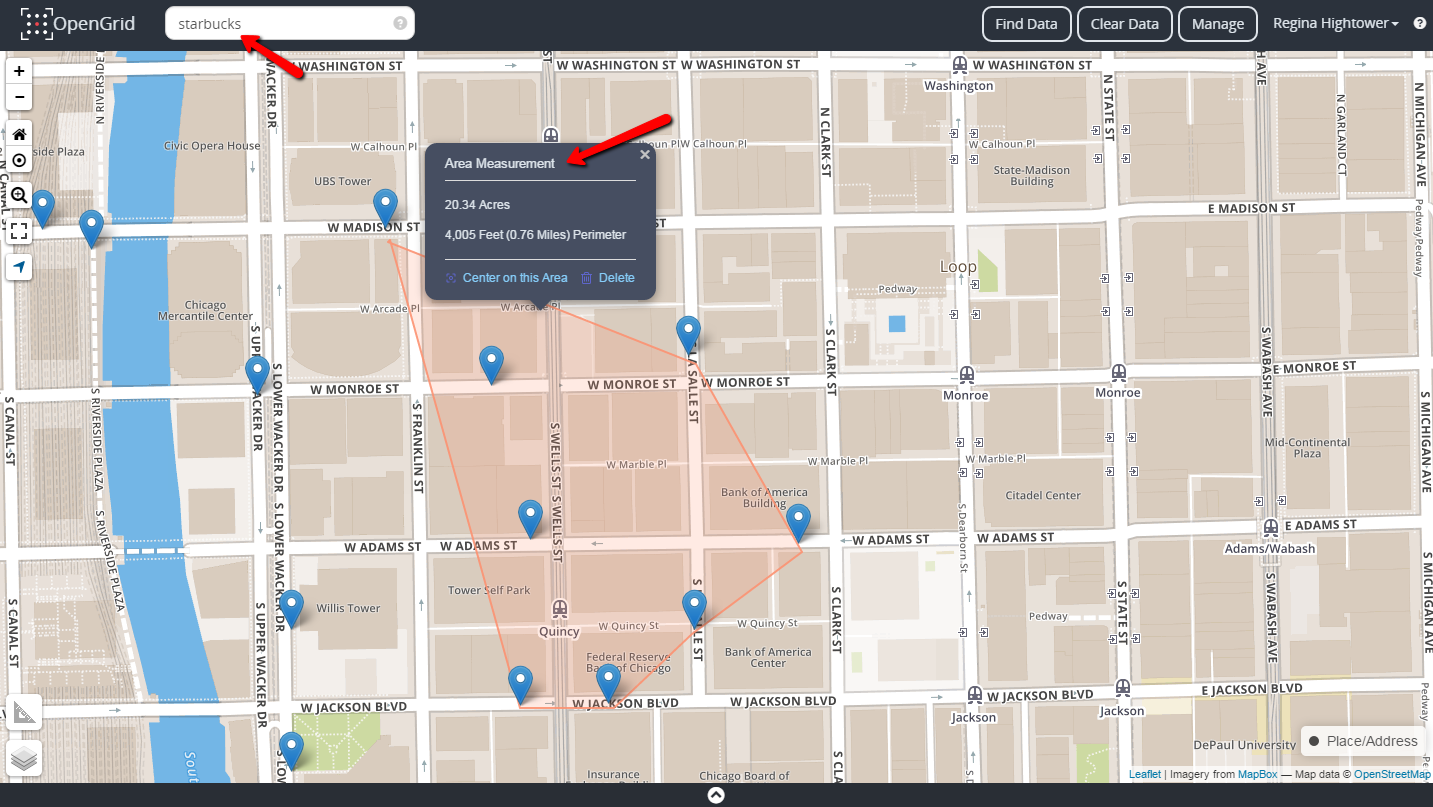
Figure 7c. Area Measurement
Types of Searches
Quick Search
A Quick Search box can be used to perform common searches that will support the following commands/inputs:
| Query Type | Description | Command Syntax | Sample | Display Columns on Search Result |
|---|---|---|---|---|
| Address | Finds the specified address using the Map/GIS Service. | <number><direction><streetname> | 50 W. Washington | Displayed as a marker on the map |
| Latitude and Longitude | Displays a marker to show location of latitude and longitude entered. | <latitude>, <longitude> | 41.8270, -87.6423 | Displayed as a marker on the map |
| Place Name | Shows location of the place specified. | <name of place> | Daley Center | Displayed as a marker on the map |
| Tweets | Displays recent tweets matching keyword, if provided. Keyword can be a bareword or a double-quoted set of words. | tweet <keyword> | tweet |
|
| Weather | Displays a point in the middle of the map showing weather information for the zip code. | weather <zip code> | weather 60601 |
|
The data results for the above search types and any other search form will appear as point/s, custom icons or markers on the map. Any search type information, whether its performed as a Quick Search or Advanced Search will display on the map and table grid. The table grid displays data as rows.
In some cases, there will only be one row of data on the grid (for example, Weather or Bus ID search). Quick search results can be cleared/reset by clicking on the Clear Data button. This action will also stop all data auto-refresh activities, if any are happening in the background.
Tweet dataset provides real-time data and automatically refreshes with new data every 30 seconds within set intervals. The data points have active links embedded, when selected the link will open in a new browser window displaying social media content, such as articles, photos and location associated with the tweet.
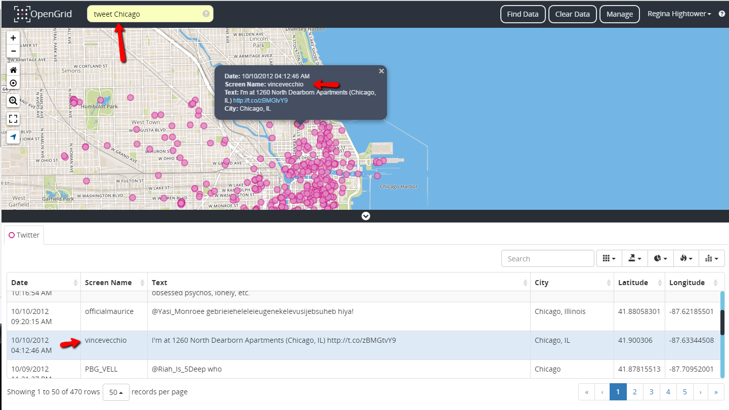
Figure 8. Quick Search on Tweets
Find Data Panel
Note: Manage Queries, Load Saved Query and Save Query As seen in the image below are configurations that can be enabled and disabled within the application. These attributes does not appear in opengrid.io.
Advanced Search
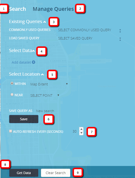
Figure 9. Find Data Panel
The Find Data Panel is where more defined searches are built, saved and existing searches are executed.
| Section No. | Description |
|---|---|
|
|
Search Link - Displays the Advanced Search Panel. |
|
|
Manage Queries Link - Stores saved searches. |
|
|
Existing Queries
|
|
|
Select Data
|
|
|
Select Location
|
|
|
Save Query As |
|
|
Auto-Refresh Every (SECONDS) |
|
|
Get Data - Executes a search. |
|
|
Clear Search - Resets the Find Data Panel. |
The Find Data Panel is also called the advanced search, it is used to narrow searches by applying a series of different filters and actions. The user has the ability to enter a combination of search criteria by applying one or more datasets, adding rule/s or group/s for building a search. The panel has map extent setup as default when performing a search; when a search is executed all data will plot within the area of the current map location boundary.
All datasets have a default color in case multiple datasets are applied on the map, it helps differentiate between the data. The user also has the ability to modify color, size and opacity of each data point pertaining to a dataset.
Using food establishments as an example, a user can search for restaurants and food trucks in Chicago, the two criteria is listed under a single dataset, called Business Licenses. A user may want to run multiple Business Licenses criteria in a single search for comparison purposes. What should a user do since there is a one color limitation and default color per dataset setup?
Simple, just add Business Licenses dataset twice, then set one with a filter License_description = “Retail Food Establishment” and the other License_description = “Mobile Food License”, and assign each dataset a different color by selecting the “Color Option” tool beneath each dataset setup.
In the example below, it shows how the search was applied and how each data type is represented on the grid... Retail Food Establishments has the default color of Blue and Mobile Food Licenses is Red.
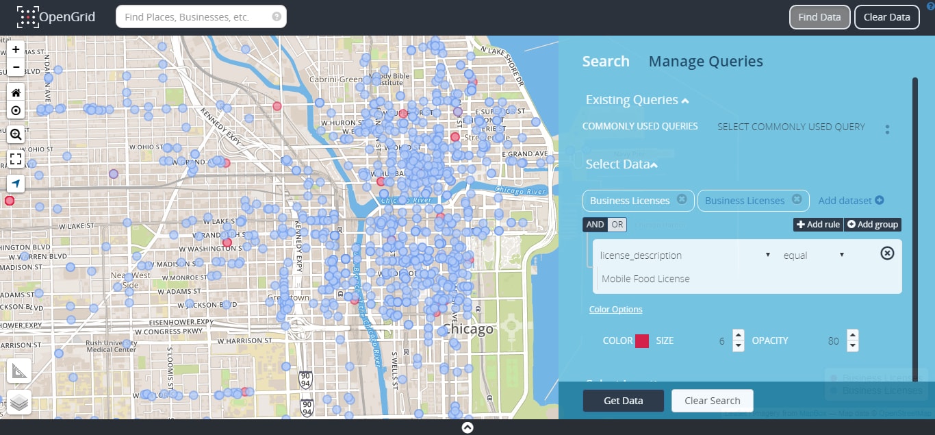
Figure 10. Business Licenses Dataset Example
To further filter a search, a geo-spatial filter can be applied by drawing a shape on a targeted area on a map or selecting one of the pre-defined boundaries from the Select Location section of the panel. Select Location has two geo-spatial options called WITHIN and NEAR (see images below).
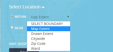
Figure 11a. WITHIN Boundary
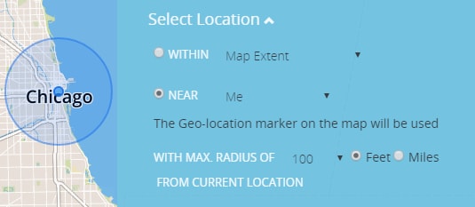
Figure 11b. NEAR Me
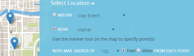
Figure 11c. NEAR Marker
Amongst applying boundaries to a search, auto refresh component can be setup for a search by the number of intervals in seconds (minimum of 30 seconds, maximum of 3600 seconds or 60 minutes).
When a query is submitted, the application will display a message when the query times out. It will also display a message when the search service returns no data.
Existing Queries
Commonly Used Queries
Are popular searches that city residents are most likely to explore within the application. The drop menu has a list of predefined queries that a user can apply as a search.
Each query when selected displays its search parameters under the Select Data section. To run commonly used queries, select a search from the drop list and select Get Data.
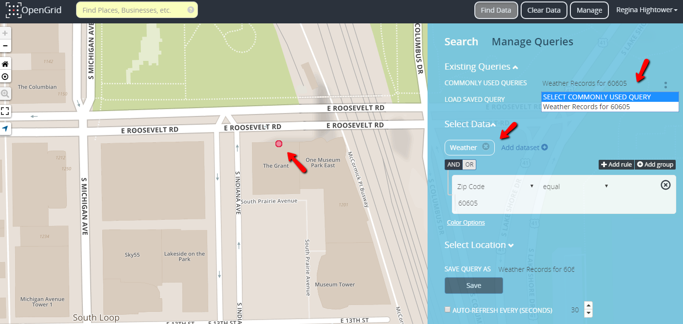
Figure 12. Commonly Used Queries
Data Formation
Map Grid
The map grid is interactive, a user can navigate the map using a mouse, keyboard and for mobile devices by swiping using index finger. The map displays the maximum of 1000 points. All data appears on the grid as points and/or markers. Places/Address search plot as markers and Datasets plot as points on the grid. The map legend appears on the grid when a search has been executed, displaying the color of the data point and the name of the data being displayed. A retractable information box appears to the bottom right of the grid when a search is performed, displaying the No. of records found or an error message pertaining to a search. The grid has an automatic refresh feature for updating and re-plotting data upon navigating around the map.
Table Grid
The table grid is located at the bottom of the map. The table becomes active when a search has been performed and returns a set of results on the map. To access the table after a search, click on the black bar at the bottom of the map, there is a white carat displayed in the middle of the black bar below as an indicator that the bar is collapsible. After clicking on the bar, the table will expand upward exposing the table and its components.
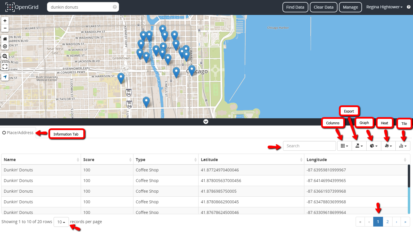
Figure 13. Table Grid
Components of the Table Grid
Information Tab
- Search type (i.e. Place/Address, Business License).
Search Textbox
- Used to filter by data components within the table.
Columns Icon
- Provides a drop list of available columns pertaining to the data within the datasets. The columns are interchangeable, user can enable and disable certain columns from the table by selecting or deselecting each column name from the column list.
Export Icon
- Provides a drop-list of available exportation options used to send or transfer data from the table into the following formats:
- CSV - Comma Separated Values
- PDF - Portable Document Format
- MS Excel - Microsoft Excel
Graph
- Places the search results into a pie chart it is group by certain parameters from the search depending on the dataset.
Heat Map
- Data that’s contained in a matrix within a representation of colors to use for analysis, comparison or trending purposes.
Tile Map
- Small images, usually rectangular or isometric layers that acts as puzzle pieces to cover an intended area.
Rows Droplist
- Provides a drop list of total number of rows that can be displayed per page.
Page Numbers
- Interactive number links for maneuvering through pages.
Saving Searches
OpenGrid allows a user to create searches; there is also an option to save a search. To save a query, define a name for your search within the “Save Query As” section of the Find Data Panel. A successful save will return a message in the lower right corner, “Query was successfully saved".
A search is saved and stored in the Manage Queries panel. Saved searches are also accessible within the LOAD SAVED QUERY drop list located in the Existing Queries section of the Find Data Panel. Load Saved Query section stores the ten most recent saved searches.
A saved search can also be overwritten upon user discretion. To overwrite a search, simply access the save search in the list and within the “Save Query As” textbox remove the saved search name and redefine it. Select the Save button to execute the new save. A warning message within a decision textbox will appear alarming the user that the name already exist, would you like to continue with the overwrite and as a result it will overwrite the existing query with that name.
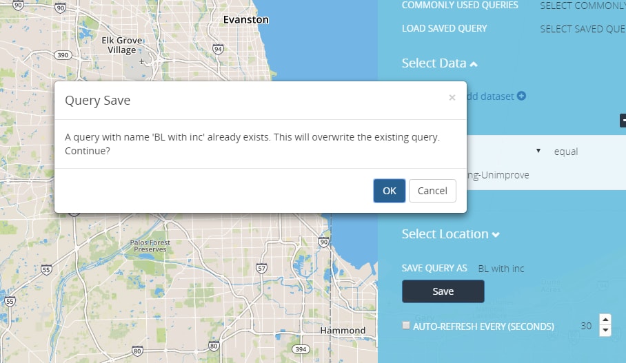
Figure 14. Query Overwrite
Administrator
The admin screen is accessible by selecting the Manage Button. Administrator capabilities are available for admin users only. Manage Users and Manage Groups are active links; when selected their panel is exposed. Admin users can perform the following tasks:
- Add/ Remove Users
- Update Users
- Delete Users
- Add/Remove Roles
- Add a Group
- Add/Remove Group
Manage Groups
To setup a group under the Manage Group link, select the green new group. The administrator will need to provide a Group ID, the group ID when initially created and saved will no longer be editable; name of the group and a description for the group, in which both are editable. There are two check boxes “Is Admin Group” which is an optional configuration that signifies the group is for admin use only; “Enabled” , activates the new group for usage. To save the new group, select the Submit button, this action will cause the group to be saved and stored within the manage groups panel list. Once a new group has been created the administrator can begin assigning the group to users.
Manage Group Panel provides information about the different types of groups created within the application and its components.
- Edit Functions (update and delete icons)
- New Group Button
- Group Details
- Functions
- Data Types
The group details column provides the name and the description of the group. The Functions columns provides a drop list of available options that are applied to a group. The administrator will have access to all options and users only has access to the advanced search option.
Manage Users
The manage users link displays a list of all available users and components.
- Edits functions (update and delete icons)
- New User Button
- User ID
- User First Name
- User Last Name
- Group options the users have access to
The new user button performs two functionalities, finding a User and Adding a User. To find a user, select “Find By User ID” or “Find By Name”. “Find By Name” search provides multiple search options to find existing or future user/s by first name, last name, or combination of both. To look-up a user select the Find button, this action will search for a user profile.
To add a new user, search for the user by name or userid. When the appropriate user is found click on the submit button. This action will add the user to the application.
To verify, if user was successfully added navigate to the Manage Users panel, scroll down the list until the username is found.